When planning a fundraiser or community event, raffle tickets often seem like the last detail on the list. For small gatherings, many organizers simply grab a design, drop their logo onto it, and print multiple copies. While this approach works for basic functionality, it misses a bigger opportunity: using your tickets to make a lasting impression. A raffle ticket is more than just an entry slip; it’s often the first piece of marketing material your supporters physically hold in their hands. At Raffles For Less, we’ve seen countless do-it-yourself ticket projects, and the same mistakes appear again and again. To help you avoid those pitfalls, we’ve highlighted the most common ones and explained how to design tickets that truly reflect your brand.
Tiny or Misplaced Logos That Get Overlooked
Your logo is the face of your brand. It’s what people recognize instantly, whether they’re seeing it on a flyer, social media post, or your raffle tickets. Yet, in many cases, logos on blank raffle tickets get reduced to a tiny afterthought in the corner of the design. When the logo is too small or poorly placed, it gets overlooked, which undermines the credibility and professionalism of your event. A misplaced logo can even confuse participants about who is running the fundraiser.
The key is to ensure your logo has the right balance of visibility and breathing space. For example, if your raffle ticket is handed around frequently, it should be positioned where it won’t get folded, torn off, or hidden by the stub. Using a well-designed raffle ticket template helps you avoid these issues because it sets clear margins and highlights the visual zones where your logo will have maximum impact. Rather than guessing, you’ll have a structure that guarantees your logo is both noticeable and professional.
Poor Contrast or Color Choices
Color is one of the most powerful tools in visual communication, and this is especially true when designing custom raffle tickets. Unfortunately, many fundraisers make the mistake of pairing similar shades like dark blue paper with dark red text which can be nearly impossible to read in low lighting. Others choose colors that don’t reflect their brand identity, leaving tickets that feel disconnected from the cause or event.
Color theory plays a role here. Contrasting tones create readability, while complementary colors create harmony and appeal. For example, a light background with a bold logo color will naturally pop and draw attention, while mismatched shades can look cluttered or dull. At Raffles For Less, we make this process easier by offering a variety of paper colors and finishes that work seamlessly with your existing brand palette. Before finalizing your ticket style, you can also check out our pricing page to compare the different options available. Investing in the right color scheme ensures that your tickets don’t just “do the job,” but they actively reinforce your brand identity and catch the eye of every participant.
Too Much Text, Not Enough Clarity
Information overload is another frequent mistake with printable raffle tickets. It’s tempting to include every possible detail, event rules, sponsor information, prize descriptions, disclaimers but cramming text into every corner of your ticket leads to clutter. Instead of being informative, your design becomes overwhelming. This not only distracts the viewer but also risks burying the essential details, such as the event name, date, or ticket number.
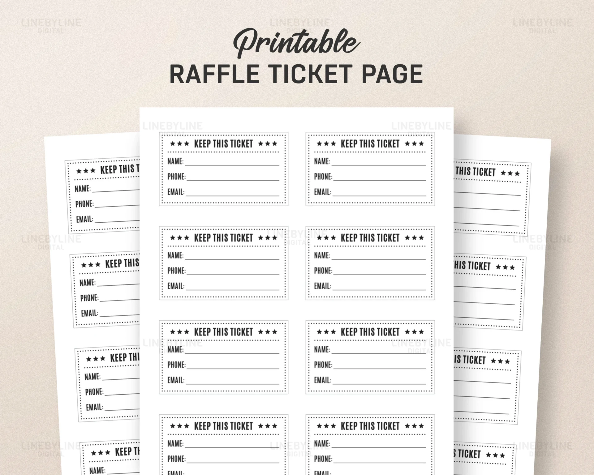
Another overlooked element is numbering. Without clear, sequential numbering, raffle draws can feel disorganized or unfair. At Raffles For Less, we integrate built-in numbering into our custom raffle ticket printing, saving you the hassle and ensuring your tickets look organized from the start. By keeping your text concise and emphasizing hierarchy (for example, bolding the event name but simplifying smaller details), you create tickets that are easy to read, trustworthy, and visually appealing. A minimalist approach often communicates professionalism far better than a cluttered design.
Clarify Your Brand Identity
Jumping straight into design without defining your brand identity is like building a house without a foundation. A raffle ticket is not just a stub for entry, it’s a marketing tool that extends your story into people’s hands. Before you finalize any designs, take time to think about what your organization represents and how that identity should translate onto your ticket.
Ask yourself: “If someone only saw our ticket, would they know who we are and what we stand for?” If the answer is no, then you need to refine your branding approach. Consider your logo placement, your color palette, and your typography. Even small details can make a big difference. To see how Raffles For Less supports organizations with their branding journey, visit our About Us page. There, you’ll learn how we help schools, nonprofits, and community groups design raffle tickets that look polished and unmistakably branded.
Printed Materials vs. Digital Design
One of the most overlooked aspects of design is the difference between digital and print. What looks bright and sharp on your computer screen often looks darker or less vibrant when printed. Fonts that seem clear on-screen may appear too small or faint in real life, and logos may lose crispness if they’re not formatted correctly. This discrepancy happens because screens use light (RGB) while printers use ink (CMYK).
This is where a printable raffle ticket template becomes essential. A well-structured template accounts for these differences, helping you choose font sizes, colors, and layouts that will translate effectively into print. By using templates designed specifically for tickets, you reduce the risk of disappointment when your tickets come back from the printer looking different from what you envisioned.
Every Ticket Detail Counts
Once you have defined your brand identity and understood the basics of design translation, it’s time to focus on the details. Many organizers underestimate how much paper type, size, numbering, and finishing can influence the overall impression of their raffle tickets. Yet, these elements are the finishing touches that transform a simple ticket into a branded piece of marketing material.
If you’re unsure about which options would suit your event, don’t worry you can reach out to us anytime through our Contact Us page. Our team can guide you through choosing paper colors, deciding on finishes, and ensuring your tickets align perfectly with your event branding.
Paper Color, Size, and Finish
Paper selection is about more than aesthetics. It directly impacts how your brand is perceived. For instance, using a light paper with bold dark text makes your ticket easy to read and professional-looking. Conversely, dark paper with low-contrast fonts can make tickets look cheap or even unreadable. Ticket size also matters: larger tickets give you more space to include details, while smaller tickets force clarity and conciseness.
The finish of your ticket contributes to its tactile quality. A matte finish feels polished, understated, and modern, while glossy finishes can sometimes appear less professional. Choosing wisely communicates to participants that you’ve invested in a quality experience, not just a quick fix.
Numbering, Perforation, and Padding
While appearance is crucial, functionality is equally important. A ticket that looks good but doesn’t perform well will frustrate your guests. Sequential numbering ensures every ticket is unique and the raffle is conducted fairly. Perforation lines make stub tearing smooth and quick, avoiding messy rips during the event. Padding and stapling options keep stacks of tickets neat, preventing disorganization during distribution.
If you’re designing tickets with a printable raffle ticket template, always consider where the perforation lines will fall so your logo, branding, or text isn’t accidentally cut off. When you order from Raffles For Less, these details are already integrated, giving you one less thing to worry about.
Design with Purpose
A blank raffle ticket is like a blank canvas: how you use the space will determine whether your ticket is simply functional or an extension of your brand identity. A thoughtfully designed ticket has the power to generate excitement, reinforce professionalism, and even increase participation.
Ticket Layouts That Get Noticed
Placement is everything in design. The “visual center” of your ticket is the first area people’s eyes naturally gravitate toward, often the top or middle section. That’s why most professional branded raffle tickets position their logos and event titles there. Using templates from Raffles For Less ensures you have built-in safe zones and clear layout guidelines so that no important information gets lost.
Choosing Font Size & Hierarchy
Typography influences how your information is consumed. The event name should always be the most prominent element, often in bold, large text. Prize details, sponsors, and disclaimers can be smaller but still legible. Creating this hierarchy guides the reader’s eye, ensuring they don’t miss key information. By applying this principle, your raffle ticket doesn’t just look neat it communicates with clarity and professionalism.
Review, Test, Order
Once your design is complete, the work isn’t over. Before you send your tickets off for mass printing, you should always take the time to proof and test them. This step saves you from costly mistakes and ensures your tickets look exactly as intended.
Proof Check
Small typos or design errors can make a ticket look sloppy and unprofessional. Proofreading your content event names, dates, times, and sponsor details is essential. At Raffles For Less, you can review your design on our home page before confirming your order. This built-in safeguard ensures your final product is free from mistakes and represents your brand with confidence.
Sample Checks
Printing a sample is a smart move, especially if you’re experimenting with unique colors, finishes, or layouts. A physical proof allows you to confirm that your colors appear as expected, your logo is sharp, and your fonts are readable. This step can save you from expensive reprints and gives peace of mind that your tickets will make the right impression.
Keep Tickets Consistent with Event Branding
Your raffle tickets should never exist in isolation. They should align visually with your event flyers, banners, posters, and social media graphics. Consistent branding builds recognition and trust while helping your event look polished and professional. When your raffle ticket reflects the same identity as the rest of your marketing materials, it becomes an extension of your story.
Final Thoughts
At first glance, raffle tickets might seem like small, insignificant pieces of paper. But in reality, they are powerful marketing tools that extend your brand and event identity into the hands of every participant. Whether you’re working with blank raffle tickets, customizing a printable raffle ticket template, or investing in fully custom raffle ticket printing, each design choice you make logo placement, color contrast, numbering, and paper finish contributes to the impression people take home.
A well-designed raffle ticket is more than functional; it’s like a handshake with your community. It sparks recognition, builds trust, and creates excitement. With careful planning and the help of Raffles For Less, your tickets won’t just get the job done; they’ll represent your brand in the best possible light and help your fundraiser feel truly professional.
